Dept. of the Interior Website

Details
My Role: UX Researcher/UI Designer
Tools: Figma/Figjam, Invision, Zoom, Google, Slack
Time Frame: 3 weeks
The Challenge
When navigating the US Department of Interior website users encountered frustration with the amount of disorganized categories and visual clutter. Many of the locations for links were confusing and users did not know where to find certain sections. The site presented an overwhelming amount of inconsistent design and navigation, disorganized and redundant information, a cluttered aesthetic, compromised heuristics and UI principles and wording that created confusion. We found among other issues were lack of consistency, improper use of hierarchy, standards and recognition.
The Solution
We executed information architecture restructuring and user interface redesign with the objective of applying the UX and UI best practices and achieving a pleasant user experience. The main objective of this project was to provide the user with a clear and balanced path that will allow them to effortlessly find the information they are looking for.
User Interviews
My team conducted 5 user interviews on the Department's current website. We focused on users that have never used the site before.
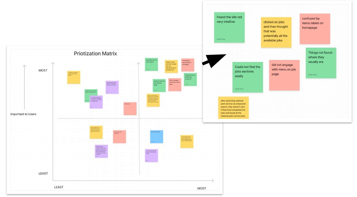
Top 3 Issues Users Experienced
Menu labels confusing
Had trouble finding open jobs
Site was not intuitive
Identifying User Needs
Many users coming to the Department of Interiors site have trouble navigating the site through all the clutter and confusing jargon. We noted the navigation is not consistent/confusing, and the use of headers was inconsistent.
Ideation
We decided to restructure the home page navigation to provide solutions to alleviate users’ frustrations. We changed the verbiage for several labels and eliminated information redundancy. We also choose a more pleasing color scheme.

Style Guide
We kept the primary layout the same as the original site, but we gave it a modern twist with vibrant updated images and bold retro colors.

Card Sorting
We renamed sections and resorted the new pages into new categories. This will provide easier navigation and consistency to the new drop-down menu and website.
Low-Fidelity Prototype
Our new low-fidelity design helped us to prioritize the new navigation which directs the user in the simplest way possible. We also highlighted more important information for more visibility.

Homepage and Press Releases
Using more inviting colors adds visual interest to each page, and also represent the government office with professionalism and intrigue.
Iterations
We made changes based on several rounds of user testing feedback. Our new iterations will help eliminate usability issues in the future.

Changing "Join" to "Jobs" in the navigation bar
Adding color blocking to call out sections
Changing "Careers" to "Jobs"
Eliminated information redundancy
Added more spacing to create intrigue and provide balance
Removed social media redundancy
Final Design
As I worked through this project, I was able to explore the in-depth process of the UX procedure. The user testing I performed was very valuable and helped me to look beyond what my team thought to be the possible issues within the website and to focus on what the user actually would like to see and find within the DOI website. I have redesigned a more straightforward site that will alleviate the issues users previously experienced.
